App icons
A unique, memorable icon communicates the purpose and personality of your experience and can help people recognize your app or game at a glance in the App Store and on their devices.
독특하고 기억에 남는 아이콘은 당신의 경험의 목적과 성격을 전달하고 사람들이 앱 스토어와 그들의 기기에서 당신의 앱이나 게임을 한 눈에 알아볼 수 있도록 도와줄 수 있습니다.
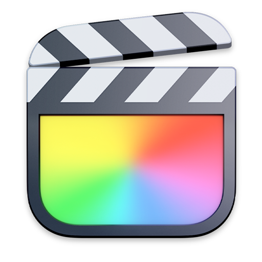
Beautiful app icons are an important part of the user experience on all Apple platforms and every app and game must have one. Each platform defines a slightly different style for app icons, so you want to create a design that adapts well to different shapes and levels of detail while maintaining strong visual consistency and messaging. To download templates that help you create icons for each platform see Apple Design Resources. For guidance on creating other types of icons, see Icons.
아름다운 앱 아이콘은 모든 애플 플랫폼에서 사용자 경험의 중요한 부분이며 모든 앱과 게임에는 반드시 있어야 합니다. 각 플랫폼은 앱 아이콘에 대해 약간 다른 스타일을 정의하므로 시각적 일관성과 메시징을 강하게 유지하면서 다양한 모양과 세부 수준에 잘 맞는 디자인을 만들고자 합니다. 각 플랫폼에 대한 아이콘을 만드는 데 도움이 되는 템플릿을 다운로드하려면 Apple 설계 리소스를 참조하십시오. 다른 유형의 아이콘 만들기에 대한 지침은 아이콘을 참조하십시오.
Best practices
Embrace simplicity. Simple icons tend to be easier for people to understand and recognize. Find a concept or element that captures the essence of your app or game, make it the focus point of the icon, and express it in a simple, unique way. Avoid adding too many details, because they can be hard to discern and can make an icon appear muddy, especially at smaller sizes. Prefer a simple background that puts the emphasis on the primary image — you don’t need to fill the entire icon with content.
단순함을 받아들이세요. 간단한 아이콘은 사람들이 이해하고 인식하기 더 쉬운 경향이 있다. 앱이나 게임의 본질을 포착하는 개념이나 요소를 찾아 아이콘의 초점으로 만들어 단순하고 독특한 방식으로 표현한다. 너무 많은 세부 정보를 추가하지 마십시오. 특히 작은 크기에서는 식별하기 어렵고 아이콘이 흐려질 수 있습니다. 기본 이미지를 강조하는 단순한 배경을 선호합니다. 아이콘 전체를 내용으로 채울 필요는 없습니다.
Create a design that works well on multiple platforms so that it feels at home on each. If your app or game runs on more than one platform, use a similar image and color palette for all icons while rendering them in the style that’s appropriate for each platform. For example, in iOS and watchOS, the Mail app icon uses a streamlined, graphical style to depict the white envelope on a blue background; macOS uses a similar blue background, adding depth and detail to the envelope, giving it a realistic weight and texture.
여러 플랫폼에서 잘 작동하는 디자인을 만들어 각 플랫폼에서 편안하게 느낄 수 있도록 하십시오. 앱이나 게임이 둘 이상의 플랫폼에서 실행되는 경우 모든 아이콘에 대해 비슷한 이미지와 색상 팔레트를 사용하고 각 플랫폼에 적합한 스타일로 렌더링하십시오. 예를 들어, iOS 및 watchOS에서 Mail 앱 아이콘은 유선형 그래픽 스타일을 사용하여 파란색 배경에 흰색 봉투를 묘사합니다. macOS는 비슷한 파란색 배경을 사용하여 봉투에 깊이와 세부 사항을 추가하여 현실적인 무게와 질감을 제공합니다.
Prefer including text only when it’s an essential part of your experience or brand. Text in icons is often too small to read easily, can make an icon appear cluttered, and doesn’t support accessibility or localization. In some contexts, the app name appears near the icon, making it redundant to display the name within it. Although using a mnemonic like the first letter of your app’s name can help people recognize your app or game, avoid including nonessential words that tell people what to do with it — like "Watch" or "Play" — or context-specific terms like "New" or "For iOS."
당신의 경험이나 브랜드에 필수적인 부분일 때만 텍스트를 포함하는 것을 선호합니다. 아이콘의 텍스트가 너무 작아서 쉽게 읽을 수 없고 아이콘이 지저분하게 보일 수 있으며 접근성 또는 지역화를 지원하지 않습니다. 일부 상황에서는 앱 이름이 아이콘 근처에 나타나므로 아이콘 내에서 이름을 표시하는 것이 중복됩니다. 앱 이름의 첫 글자와 같은 니모닉을 사용하면 사람들이 앱이나 게임을 인식하는 데 도움이 될 수 있지만, "Watch" 또는 "Play"와 같이 사용자에게 무엇을 해야 하는지 알려주는 불필요한 단어나 "New" 또는 "iOS용"과 같은 상황별 용어를 포함하는 것은 피하십시오
Prefer graphical images to photos and avoid replicating UI components in your icon. Photos are full of details that don’t work well when viewed at small sizes. Instead of using a photo, create a graphic representation of the content that emphasizes the features you want people to notice. Similarly, if your app has an interface that people recognize, don’t just replicate standard UI components or use app screenshot in your icon.
사진보다 그래픽 이미지를 선호하고 아이콘에서 UI 구성요소를 복제하지 않도록 합니다. 사진은 작은 크기로 볼 때 잘 작동하지 않는 세부 정보로 가득 차 있습니다. 사진을 사용하는 대신 사용자가 주목할 기능을 강조하는 내용의 그래픽 표현을 만듭니다. 마찬가지로, 앱에 사람들이 인식하는 인터페이스가 있다면 표준 UI 구성 요소를 복제하거나 아이콘에 앱 스크린샷을 사용하지 마십시오.
If needed, optimize your icon for the specific sizes the system displays in places like Spotlight search results, Settings, and notifications. For iOS, iPadOS, and watchOS, you can tell Xcode to generate all sizes from your 1024×1024 px App Store icon, or you can provide assets for some or all individual icon sizes. For macOS and tvOS, you need to supply all sizes. If you want to forego the system-generated versions of your app icon and instead create your own, make sure the image remains clear as icon size decreases. For example, you might remove fine details and unnecessary features, simplifying the image and exaggerating primary features. If you need to make such changes, keep them subtle so that your app icon remains visually consistent in every context.
필요한 경우 스포트라이트 검색 결과, 설정 및 알림과 같은 위치에 시스템이 표시하는 특정 크기에 맞게 아이콘을 최적화합니다. iOS, iPadOS 및 watchOS의 경우 Xcode에 1024x1024px App Store 아이콘에서 모든 크기를 생성하도록 지시하거나 일부 또는 모든 개별 아이콘 크기에 대한 자산을 제공할 수 있습니다. macOS와 tvOS의 경우 모든 사이즈를 공급해야 합니다. 앱 아이콘의 시스템 생성 버전을 포기하고 대신 자신의 아이콘을 만들려면 아이콘 크기가 줄어들더라도 이미지가 선명하게 유지되도록 하십시오. 예를 들어, 세부 정보와 불필요한 기능을 제거하여 이미지를 단순화하고 기본 기능을 과장할 수 있습니다. 이러한 변경이 필요한 경우 앱 아이콘이 모든 컨텍스트에서 시각적으로 일관되게 유지되도록 변경 내용을 미묘하게 유지하십시오.

Design your icon as a full-bleed square image. On most platforms, the system applies a mask that automatically adjusts icon corners to match the platform’s aesthetic. For example, watchOS automatically applies a circular mask. The exception is macOS: Although the system applies the rounded rectangle appearance to the icon of an app created with Mac Catalyst, you need to create your macOS app icon in the correct shape. For downloadable production templates that help you create app icons for each platform, see Apple Design Resources.
아이콘을 완전한 사각형 이미지로 디자인합니다. 대부분의 플랫폼에서 시스템은 플랫폼의 미적 요소에 맞게 아이콘 모서리를 자동으로 조정하는 마스크를 적용한다. 예를 들어, 시계OS는 자동으로 원형 마스크를 적용합니다. MacOS는 예외입니다. 시스템이 둥근 직사각형 모양을 Mac Catalyst로 만든 앱의 아이콘에 적용하더라도 올바른 모양으로 MacOS 앱 아이콘을 만들어야 합니다. 각 플랫폼에 대한 앱 아이콘을 만드는 데 도움이 되는 다운로드 가능한 프로덕션 템플릿은 Apple Design Resources를 참조하십시오.
Consider offering an alternate app icon. In iOS, iPadOS, and tvOS, people can choose an alternate version of an icon, which can strengthen their connection with the app or game and enhance their experience. For example, a sports app might offer different icons for different teams. Make sure that each alternate app icon you design remains closely related to your content and experience; avoid creating a version that people might mistake for the icon of a different app. When people want to switch to an alternate icon, they can visit your app’s settings.
대체 앱 아이콘을 제공하는 것을 고려해 보십시오. iOS, 아이패드OS, TVOS에서 사람들은 대체 버전의 아이콘을 선택할 수 있으며, 이것은 앱이나 게임과의 연결을 강화하고 그들의 경험을 향상시킬 수 있다. 예를 들어, 스포츠 앱은 팀마다 다른 아이콘을 제공할 수 있습니다. 사용자가 디자인하는 각 대체 앱 아이콘은 사용자의 콘텐츠 및 경험과 밀접한 관련이 있는지 확인하십시오. 다른 앱의 아이콘으로 착각할 수 있는 버전을 만들지 마십시오. 사람들이 대체 아이콘으로 전환하기를 원할 때, 그들은 당신의 앱의 설정을 방문할 수 있다.
NOTE
As with a primary app icon, alternate app icons are also subject to app review and must adhere to the App Store Review Guidelines. 주 앱 아이콘이 있는 경우 대체 앱 아이콘도 앱 검토 대상이며 앱 스토어 검토 지침을 준수해야 합니다.
Don’t use replicas of Apple hardware products. Apple products are copyrighted and can’t be reproduced in your app icons.
Apple 하드웨어 제품의 복제본을 사용하지 마십시오. Apple 제품은 저작권이 있으며 앱 아이콘에서 복제할 수 없습니다.
Platform considerations
iOS, iPadOS
Don’t add an overlay or border to your Settings icon. iOS automatically adds a 1-pixel stroke to all icons so that they look good on the white background of Settings.
설정 아이콘에 오버레이나 테두리를 추가하지 마십시오. iOS는 설정의 흰색 배경에 잘 보이도록 모든 아이콘에 1픽셀 스트로크를 자동으로 추가합니다.
macOS
In macOS, app icons share a common set of visual attributes, including a rounded-rectangle shape, front-facing perspective, level position, and uniform drop shadow. Rooted in the macOS design language, these attributes showcase the lifelike rendering style people expect in macOS while presenting a harmonious user experience.
MacOS에서 앱 아이콘은 둥근 직사각형 모양, 정면 투시, 수평 위치, 균일한 드롭 섀도우를 포함한 공통된 시각적 속성 집합을 공유합니다. macOS 디자인 언어에 뿌리를 둔 이러한 속성은 조화로운 사용자 경험을 제공하면서 macOS에서 사람들이 기대하는 실제와 같은 렌더링 스타일을 보여준다.
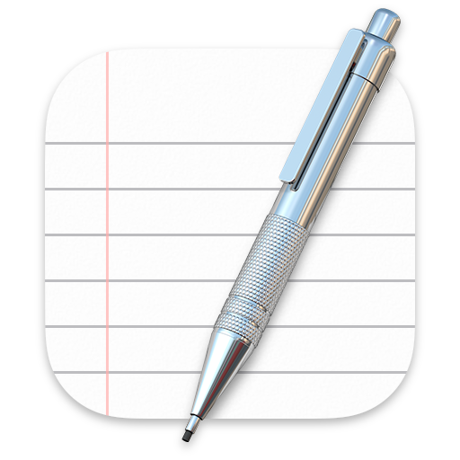
Consider depicting a familiar tool to communicate what people use your app to do. To give context to your app’s purpose, you can use the icon background to portray the tool’s environment or the items it affects. For example, the TextEdit icon pairs a mechanical pencil with a sheet of lined paper to suggest a utilitarian writing experience. After you create a detailed, realistic image of a tool, it often works well to let it float just above the background and extend slightly past the icon boundaries. If you do this, make sure the tool remains visually unified with the background and doesn’t overwhelm the rounded-rectangle shape.
사람들이 당신의 앱을 사용하여 무엇을 하는지를 전달하는 친숙한 도구를 묘사하는 것을 고려해보세요. 아이콘 배경을 사용하여 도구의 환경이나 도구가 영향을 미치는 항목을 나타낼 수 있습니다. 예를 들어, 텍스트 편집 아이콘은 샤프 펜슬과 줄이 선 종이를 연결하여 실용적인 쓰기 환경을 제안합니다. 도구의 세부적이고 사실적인 이미지를 만든 후에는 배경 바로 위에 떠서 아이콘 경계를 약간 지나도록 확장하는 것이 잘 작동하는 경우가 많습니다. 이렇게 할 경우 도구가 배경과 시각적으로 통일된 상태를 유지하고 둥근 직사각형 모양을 벗어나지 않도록 해야 합니다.
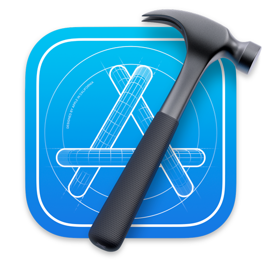
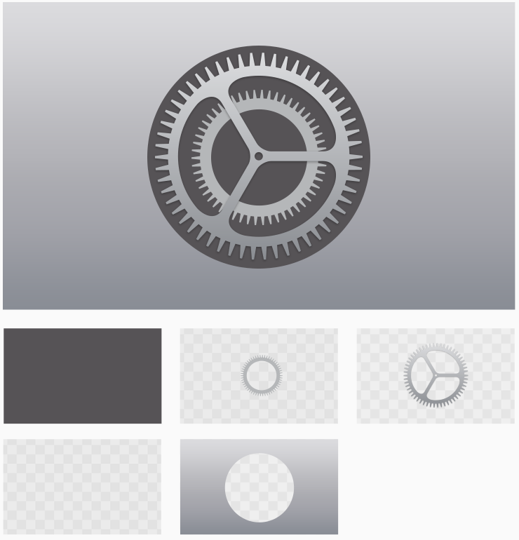
If you depict real objects in your app icon, make them look like they’re made of physical materials and have actual mass. Consider replicating the characteristics of substances like fabric, glass, paper, and metal to convey an object’s weight and feel. For example, the Xcode app icon features a hammer that looks like it has a steel head and polymer grip.
앱 아이콘에 실제 물체를 묘사하는 경우 실제 질량을 가진 물리적 재료로 만들어진 것처럼 보이게 합니다. 물체의 무게와 느낌을 전달하기 위해 직물, 유리, 종이, 금속과 같은 물질의 특성을 복제하는 것을 고려해 보십시오. 예를 들어, Xcode 앱 아이콘은 강철 헤드와 폴리머 그립을 가진 것처럼 보이는 망치를 특징으로 한다.
Use the drop shadow in the icon-design template. The app-icon template includes the system-defined drop shadow that helps your app icon coordinate with other macOS icons.
아이콘 디자인 템플릿에서 드롭 섀도우를 사용합니다. 앱 아이콘 템플릿에는 앱 아이콘이 다른 macOS 아이콘과 조정하는 데 도움이 되는 시스템 정의 드롭 섀도가 포함되어 있습니다.
Consider using interior shadows and highlights to add definition and realism. For example, the Mail app icon uses both shadows and highlights to give the envelope authenticity and to suggest that the flap is slightly open. In icons that include a tool that floats above a background — such as TextEdit or Xcode — interior shadows can strengthen the perception of depth and make the tool look real. Shadows and highlights should suggest a light source that faces the icon, positioned just above center and tilted slightly downward.
내부 그림자와 강조 표시를 사용하여 정의와 사실성을 추가하는 것을 고려해 보십시오. 예를 들어, 메일 앱 아이콘은 그림자와 강조 표시를 모두 사용하여 봉투의 신뢰성을 제공하고 플랩이 약간 열려 있음을 나타냅니다. 텍스트 편집 또는 Xcode와 같이 배경 위에 뜨는 도구를 포함하는 아이콘에서 내부 그림자는 깊이 인식을 강화하고 도구를 실제처럼 보이게 할 수 있습니다. 그림자와 하이라이트는 중심 바로 위에 위치하고 약간 아래로 기울어진 아이콘을 향하는 광원을 제안해야 한다.
Avoid defining contours that suggest a shape other than a rounded rectangle. In rare cases, you might want to fine-tune the basic app icon shape, but doing so risks creating an icon that looks like it doesn’t belong in macOS. If you must alter the shape, prefer subtle adjustments that continue to express a rounded rectangle silhouette.
둥근 직사각형 이외의 모양을 나타내는 등고선을 정의하지 마십시오. 드문 경우지만 기본 앱 아이콘 모양을 미세 조정할 수도 있지만 그렇게하면 macOS에 속하지 않는 것처럼 보이는 아이콘이 생성 될 위험이 있습니다. 모양을 변경해야 하는 경우 둥근 직사각형 실루엣을 계속 표현하는 미묘한 조정을 선호하십시오.
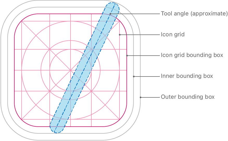
Keep primary content within the icon grid bounding box; keep all content within the outer bounding box. If an icon’s primary content extends beyond the icon grid bounding box, it tends to look out of place. If you overlay a tool on your icon, it works well to align the tool’s top edge with the outer bounding box and its bottom edge with the inner bounding box, as shown below. You can use the grid to help you position items within an icon and to ensure that centered inner elements like circles use a size that’s consistent with other icons in the system.
아이콘 그리드 경계 상자 내에 기본 콘텐츠를 유지하고, 외부 경계 상자 내에 모든 콘텐츠를 유지합니다. 아이콘의 기본 내용이 아이콘 그리드 경계 상자를 벗어나면 모양이 맞지 않는 경향이 있습니다. 아이콘에 도구를 오버레이하면 아래와 같이 도구의 상단 가장자리를 외부 경계 상자에 맞추고 하단 가장자리를 내부 경계 상자에 맞추면 잘 작동합니다. 그리드를 사용하여 아이콘 내에서 항목을 배치하고 원과 같은 중앙에 있는 내부 요소가 시스템의 다른 아이콘과 일치하는 크기를 사용하도록 할 수 있습니다.
tvOS
tvOS app icons use between two and five layers to create a sense of depth and vitality as people bring them into focus. For guidance, see Layered images.
TVOS 앱 아이콘은 2~5단 사이를 사용해 사람들이 초점을 맞추면서 깊이와 활력을 만들어낸다. 자세한 내용은 레이어드 이미지를 참조하십시오.
Use appropriate layer separation. If your icon includes a logo, separate the logo from the background. If your icon includes text, bring the text to the front so it’s not hidden by other layers when the parallax effect occurs.
적절한 레이어 구분을 사용하십시오. 아이콘에 로고가 포함된 경우 로고를 배경에서 분리하십시오. 아이콘에 텍스트가 포함되어 있으면 시차 효과가 발생할 때 텍스트가 다른 레이어에 의해 숨겨지지 않도록 텍스트를 앞으로 가져옵니다.
Use gradients and shadows cautiously. Background gradients and vignettes can clash with the parallax effect. For gradients, prefer top-to-bottom, light-to-dark styles. Shadows usually look best as sharp, hard-edged tints that are baked into the background layer and aren’t visible when the app icon is stationary.
그라데이션 및 섀도를 주의하여 사용하십시오. 배경 그라데이션 및 비네트는 시차 효과와 충돌할 수 있습니다. 그라데이션의 경우 위쪽에서 아래쪽으로 밝은 스타일에서 어두운 스타일을 선호합니다. 그림자는 일반적으로 배경 층에 구워지고 앱 아이콘이 정지해 있을 때 보이지 않는 날카롭고 단단한 색조로 가장 잘 보인다.
Leverage varying opacity levels to increase the sense of depth and liveliness. Creative use of opacity can make your icon stand out. For example, the Photos icon separates its centerpiece into multiple layers that contain translucent pieces, bringing greater liveliness to the design.
다양한 불투명도 수준을 활용하여 깊이와 생동감을 높입니다. 불투명성의 창의적인 사용은 당신의 아이콘을 돋보이게 할 수 있다. 예를 들어, 사진 아이콘은 중앙 조각을 반투명 조각이 포함된 여러 레이어로 분리하여 디자인에 더욱 생동감을 제공합니다.
Make sure your Home Screen icon adheres to safe-zone specifications. During focus and parallax, the system may crop content around the edges of your app icon as the icon scales and moves. To ensure your icon’s content isn’t cropped too tightly, allow some additional space as shown in Specifications > tvOS.
홈 스크린 아이콘이 안전 구역 사양을 준수하는지 확인하십시오. 포커스 및 시차가 발생하는 동안 아이콘의 크기가 조정되고 이동할 때 시스템은 앱 아이콘의 가장자리를 중심으로 콘텐츠를 자를 수 있습니다. 아이콘의 콘텐츠가 너무 빡빡하게 잘리지 않도록 하려면 사양 > tvOS에 표시된 것처럼 추가 공간을 확보하십시오.
watchOS
A watchOS app icon is circular and displays no accompanying text.


Avoid using black for your icon’s background. Lighten a black background or add a border so the icon doesn’t blend into the display background.
아이콘의 배경에는 검은색을 사용하지 않도록 합니다. 아이콘이 화면 배경에 섞이지 않도록 검은색 배경을 밝게 하거나 테두리를 추가합니다.
Specifications
App icon attributes
App icons in all platforms use the PNG format and support the following color spaces:
- Display P3 (wide-gamut color)
- sRGB (color)
- Gray Gamma 2.2 (grayscale)
The layers, transparency, and corner radius of an app icon can vary per platform. Specifically:
| Platform | Layers | Transparency | Asset shape |
| iOS, iPadOS | Single | No | Square |
| macOS | Single | Yes, as appropriate | Square with rounded corners |
| tvOS | Multiple | No | Rectangle |
| watchOS | Single | No | Square |
App icon sizes
iOS, iPadOS app icon sizes
You need to provide a large version of your app icon, measuring 1024x1024 pixels, to display in the App Store. You can let the system automatically scale down your large app icon to produce all other sizes, or — if you want to customize the appearance of the icon at specific sizes — you can supply multiple versions.
앱 스토어에 표시하려면 1024x1024픽셀의 대형 버전의 앱 아이콘을 제공해야 합니다. 시스템에서 대형 앱 아이콘을 자동으로 축소하여 다른 모든 크기를 생성하도록 하거나, 아이콘 모양을 특정 크기로 사용자 지정하려는 경우 여러 버전을 제공할 수 있습니다.
| @2x (pixels) | @3x (pixels) iPhone only | Usage |
| 120x120 | 180x180 | Home Screen on iPhone |
| 167x167 | – | Home Screen on iPad Pro |
| 152x152 | – | Home Screen on iPad, iPad mini |
| 80x80 | 120x120 | Spotlight on iPhone, iPad Pro, iPad, iPad mini |
| 58x58 | 87x87 | Settings on iPhone, iPad Pro, iPad, iPad mini |
| 76x76 | 114x114 | Notifications on iPhone, iPad Pro, iPad, iPad mini |
macOS app icon sizes
For the App Store, create a 1024x1024 px version of your macOS app icon. In addition, you also need to supply the icon in the following sizes.
@1x (pixels)@2x (pixels)| 512x512 | 1024x1024 |
| 256x256 | 512x512 |
| 128x128 | 256x256 |
| 32x32 | 64x64 |
| 16x16 | 32x32 |
tvOS app icon sizes
For the App Store, create a 1280x768 px version of your tvOS app icon. In addition, you also need to supply the icon in the following sizes.
App Store의 경우 1280x768px 버전의 tvOS 앱 아이콘을 생성합니다. 또한 다음 크기의 아이콘도 제공해야 합니다.
| @1x (pixels) | @2x (pixels) | Usage |
| 400x240 | 800x480 | Home Screen |
Consider allowing a safe zone in your Home Screen icon. During focus and parallax, content around the edges of your app icon may be cropped as the icon scales and moves. To ensure your icon’s content isn’t cropped too tightly, you might want to include some additional breathing room.
홈 스크린 아이콘에서 안전 영역을 허용하는 것을 고려해 보십시오. 포커스 및 시차가 발생하는 동안 아이콘의 크기가 조정되고 이동하면 앱 아이콘 가장자리 주변의 콘텐츠가 잘릴 수 있습니다. 아이콘의 내용을 너무 세게 자르지 않도록 하려면 호흡 공간을 추가로 포함하는 것이 좋습니다.
watchOS app icon sizes
For the App Store, create a 1024x1024 px version of your watchOS app icon. You can let the system automatically scale this version down to all other sizes, or — if you want to customize the appearance of your app icon at specific sizes — you can supply the sizes listed in the following table. All icon dimensions are shown in pixels @2x.
App Store의 경우 시계의 1024x1024px 버전을 생성합니다OS 앱 아이콘. 시스템에서 이 버전을 다른 모든 크기로 자동 축소하거나, 특정 크기로 앱 아이콘 모양을 사용자 지정하려는 경우 다음 표에 나열된 크기를 제공할 수 있습니다. 모든 아이콘 치수는 픽셀 @2x로 표시됩니다.
| 38mm | 40mm | 41mm | 42mm | 44mm | 45mm | 49mm | Usage |
| 80x80 | 88x88 | 92x92 | 80x80 | 100x100 | 102x102 | 108x108 | Home Screen |
| 48x48 | 55x55 | 58x58 | 55x55 | 58x58 | 66x66 | 66x66 | Notification Center |
| 172x172 | 196x196 | 196x196 | 196x196 | 216x216 | 234x234 | 258x258 | Short look |
If you have a companion iPhone app, you also need to supply your watchOS app icon in the following sizes.
만약 당신이 동반 아이폰 앱을 가지고 있다면, 당신은 또한 당신의 시계를 공급할 필요가 있다OS 앱 아이콘의 크기는 다음과 같습니다.
| @2x (pixels) | @3x (pixels) |
| 58x58 | 87x87 |
'✨ Design > ✸ Human Interface Guideline' 카테고리의 다른 글
| [히힉 .. 히..힉ㅎ] Foundations - Color (0) | 2023.02.12 |
|---|---|
| [히힉 .. 히..힉ㅎ] Foundations - Branding (0) | 2023.02.11 |
| [히힉 .. 히..힉ㅎ] Foundations - Accessibility (0) | 2023.02.03 |
| [히힉 .. 히..힉ㅎ] Foundations - Overview (0) | 2023.01.18 |
| [히힉 .. 히..힉ㅎ] Platform - Designing for macOS (0) | 2023.01.18 |


댓글